
10 Photoshop Tips for Digital Illustration
I have put together a list of 10 Photoshop tips to help you get a leg up on your next Photoshop digital illustration or painting. Most of these examples will be useful for any beginner or intermediate user. Although there are a few things might depend on knowing your way around Photoshop a bit and understanding a few of the basics. Hope this helps and inspires you to create something amazing!
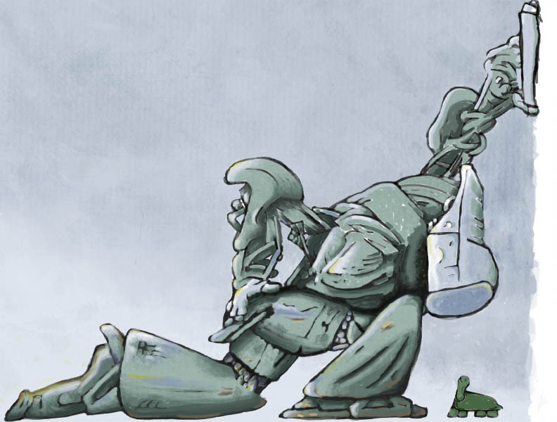
1. Start with a hand drawn sketch You would no doubt start with a sketch (or sketches) before you tackled a real painting, so this should be no different. Get out your pen or pencil and sketch away. Once finished, scan it into Photoshop. This will be used as the foundation.

2. Brushes In the brushes palette enable the smoothing option, this will give you nice, smooth curves to make the painting look convincing. Try only using these two brush presets: the Splatter brushes, the chalk brushes. The dual brushes allows you to use two brush tips in one.
(NOTE: Left Handed – like me using the preset Chalk brush you might want to enable the Flip x option. This creates a mirror image of the brush. You will want this because the brush is made for right-handed people working right to left, we lefties want left to right!)

3. Brush size the square bracket keys on the keyboard will increase or decrease the brush size when you have the brush selected.
4. Importing Brushes you can find a lot of brushes around the web, Photoshop Support for example.
5. Layers Take advantage of the layers panel. Try not to paint directly onto the original sketch. And the more layers you add the less impact big mistakes will have on the final product.
6. Pen Tablet You can do this with a mouse but I would strongly recommend to anyone to get themselves a pen tablet, I recommend a Intuos4 from Wacom. You won’t look back!

7. Painting Pick a light source and start by really quickly filling in the background. (A few white spots is fine). On a new layer go over all the white spots with your current brush, but set the opacity to around 25% and play with the color hues a bit.


8. Flow vs. Opacity Opacity is for transparency so what is the Flow setting for? The Flow controls how much paint is deposited within a brush stroke as you paint, so reducing it will make it look dryer.
9. Unique Swatches Palette Edit > Preset Manager from the menu. Choose swatches from the Preset Type. Target the first color in the list and shifts-click on the last swatch and delete them. Now click on the foreground color swatch in the toolbox, select a new foreground color from the picker and hit ok. Move the mouse over the empty area of the swatches palette and it will switch to paint bucket, click to add the new color. Keep doing this to establish your color scheme. (NOTE: See how using the Actions panel might help with this kind of thing.)
10. Saving Swatches You can save this palette for a later project by choosing the save swatches from the swatches palette menu. It saves as a library file. You can reload this file into another project at another time by choosing the load swatches from the swatches palette menu and navigating to saved presets/swatches.


Try it yourself and have some fun! Leave me a comment if you have anything to add!


About Author
I'm the curator here at designshifts.com as well as being a web developer by day. I have a passion for design and love to share inspiration and tips and tricks with the community.
These are great – you should make us a print.